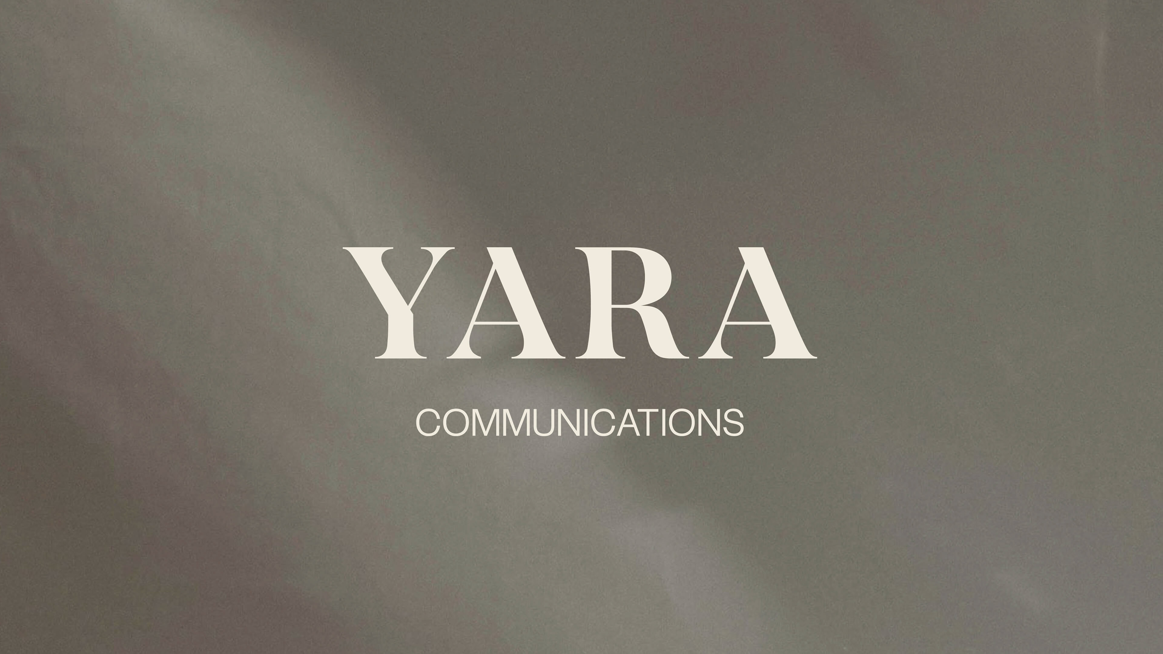
Yara Communications
Yara Communications is an independent marketing consultant specializing in marketing and content strategy. The owner wanted a visual identity that appeals to B2B, fashion, beauty, home builders, designers, and hotels. It was crucial for the brand to feel classic, mature, and informed without appearing flashy. We created an essential logo suite, mood board, and style guide for this new brand.
Project Scope:
Visual Identity
Visual Identity
Industry:
Marketing + Communications
Marketing + Communications


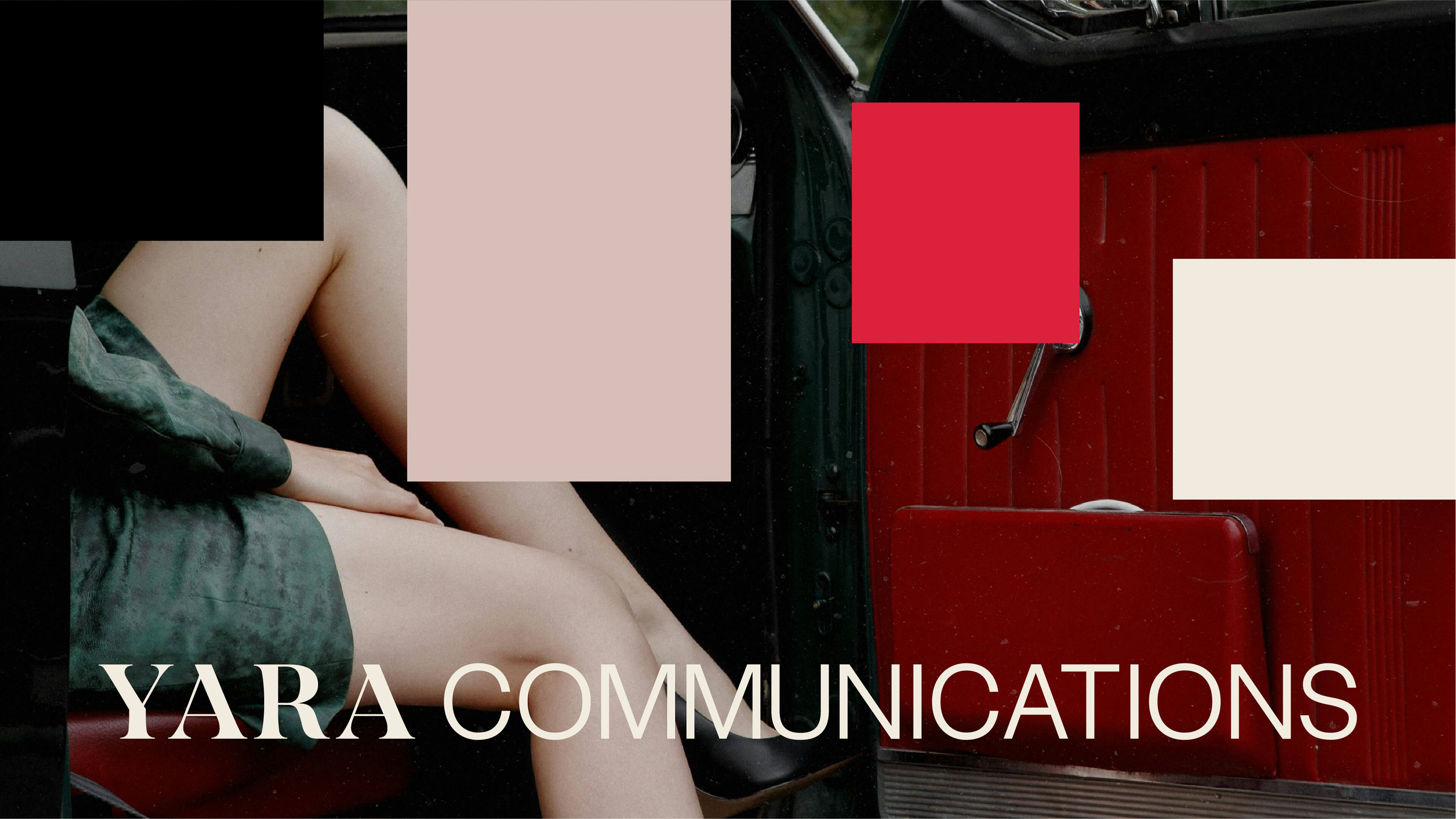
Values to Visuals
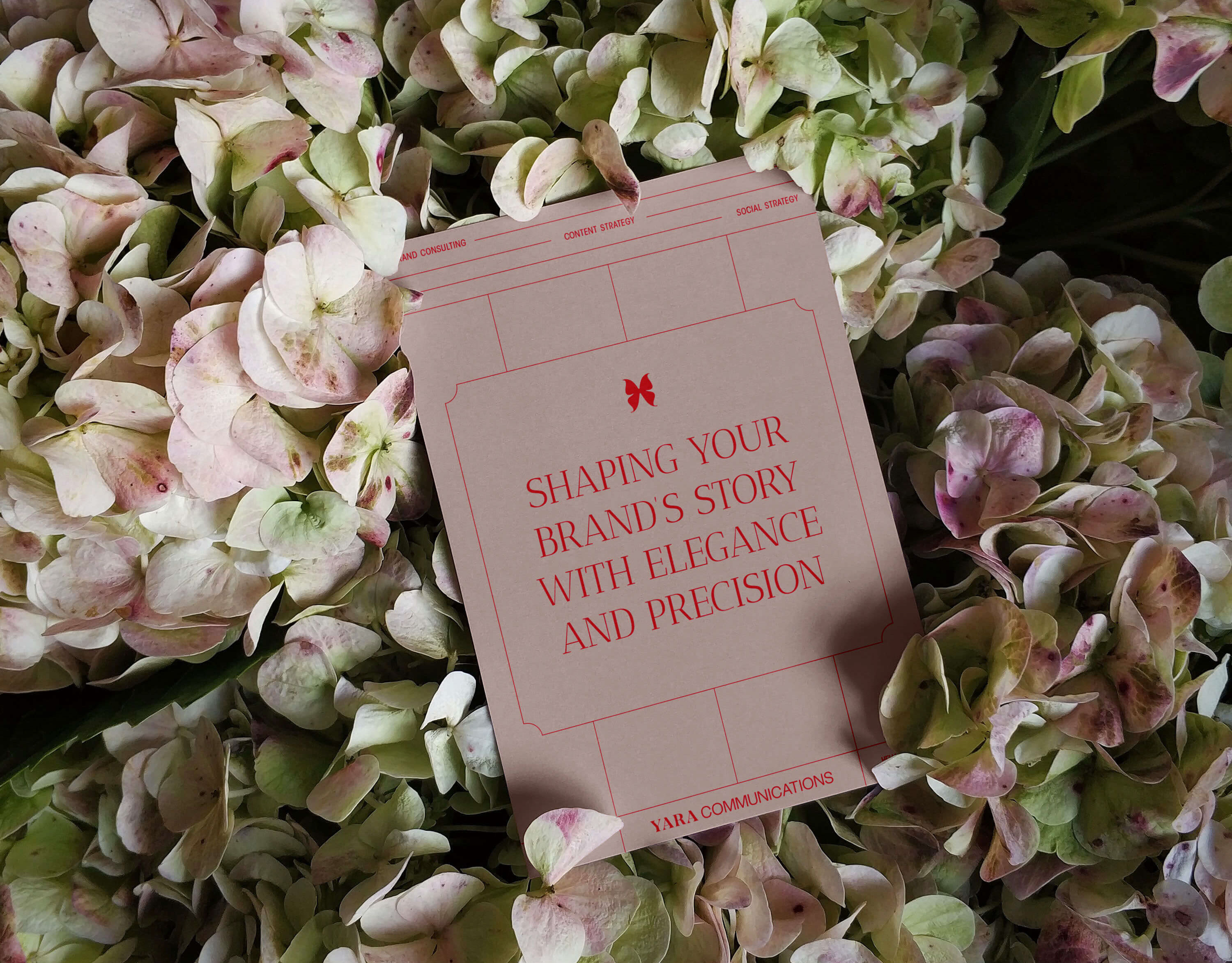
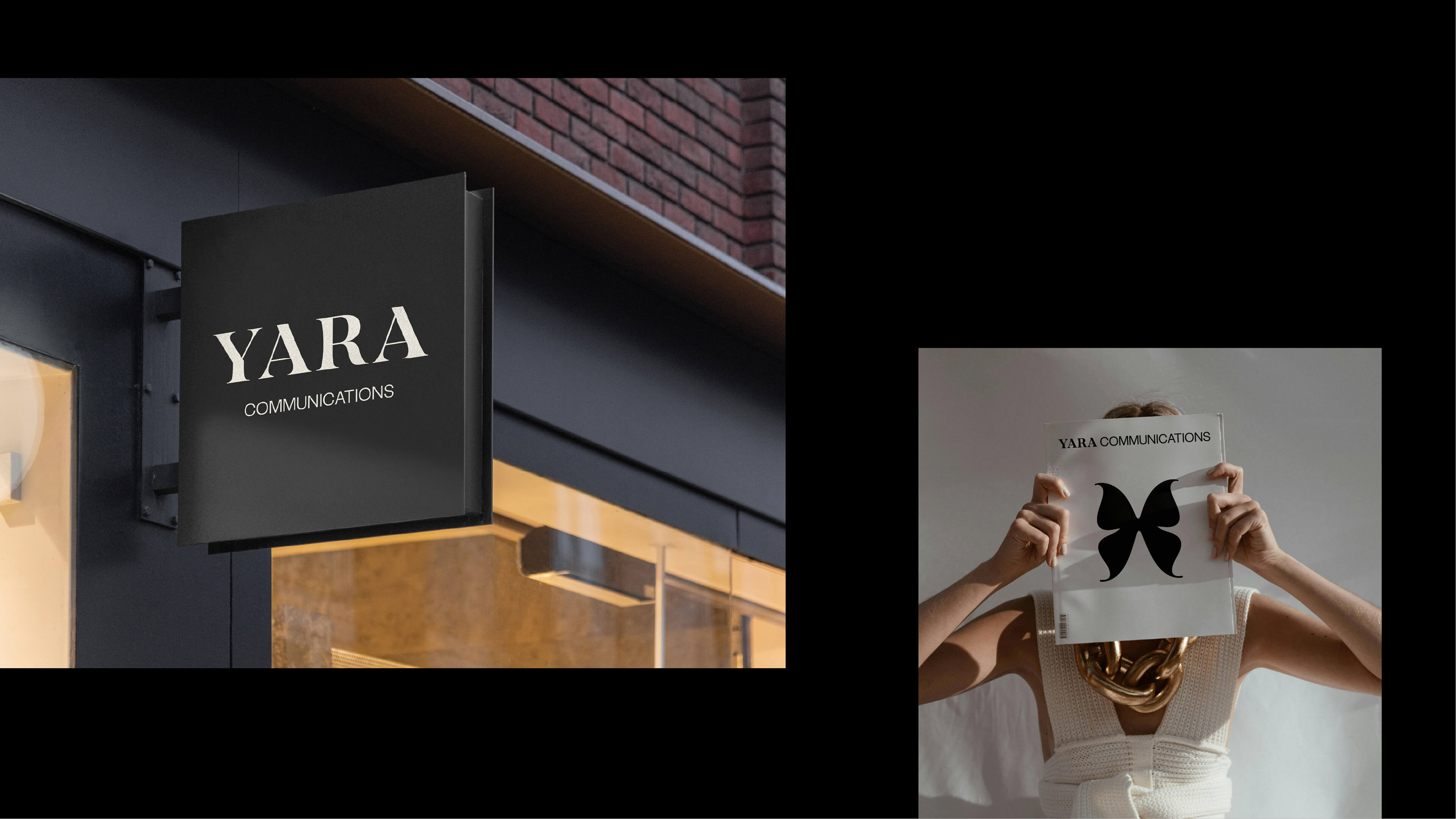
Our solution drew inspiration from established big brands known for their timeless appeal. This visual identity focuses on an elevated, understated, and timeless aesthetic. The butterfly icon represents strength, friendship, and transformation (derived from the Arabic translation of 'Yara'). This icon is also versatile for future textile or unique pattern applications (such as silk scarves), for future brand usage. The typographic styling is editorial and luxury, and 'less is more'. The colors include classic black and white, and bold and feminine reds. The colors can be strategically applied depending on use cases and target audience.

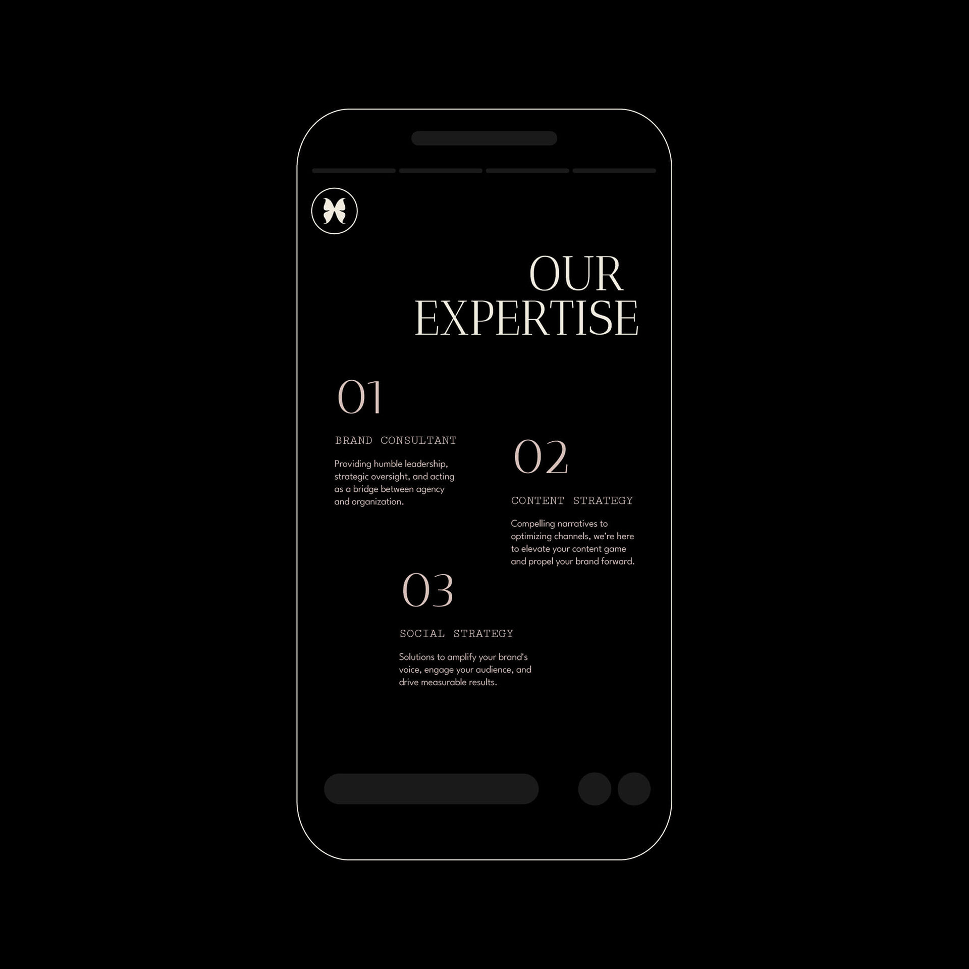
Brand in Action
To ensure a seamless brand experience across digital and print platforms, we aimed for versatility without sacrificing ease of application. Equipping the owner with a simple brand style sheet, they can effortlessly extend the brand into marketing collateral and beyond. It was important the brand be versatile, scalable, yet manageable.
Thank You
Design by Craftlea Studio
Email me at hello@craftlea.ca to collaborate.